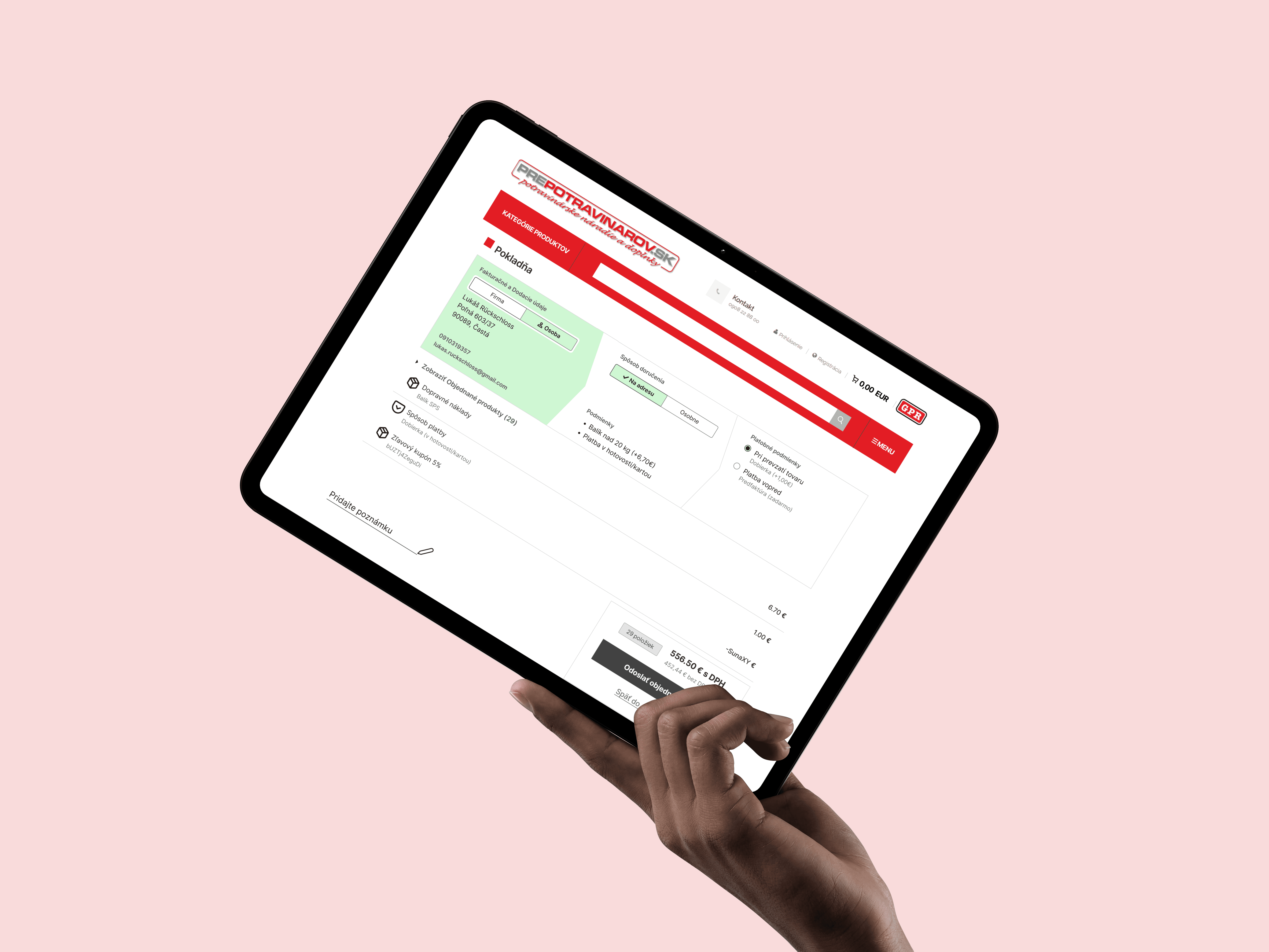
How might we help customers feel sure about their order without making them re-read the whole form?
I found a problem in GA4 and chose to solve it, which meant I had to earn buy-in instead of receiving a brief. Stakeholder for this case was manager responsible for eshop division at a time.
The previous checkout runs on a legacy system, built on older template, owned by an external provider. This did not changed during implementation. Some of what I designed could not ship as drawn, and I document those compromises further down.
Back-end business rules were fixed. For example, some payment methods are only valid for certain shipping methods. The interface had to follow those rules, not the other way around.
The project began with a red flag in GA4. Returning users took an average of 1 minute 48 seconds to complete checkout (Measured is 4/2025).
To understand why, I ran 10 customer interviews. 5 new customers and 5 returning customers. The two groups described different problems. First hypothesis was, that a bug holds customer in checkout and slows down completing the orders.
This was partly true. 3 of 5 new customers spoke about how the checkout did not remember the already completed steps after returning to checkout from browsing e-shop. Returning customers flagged re-entering their own data because the interface gave them no clear sign of what it had already remembered.
I called this the "confidence gap". Ten interviews were a small sample, that I used to find a pattern worth designing for, not to prove one.
Next, I took five sketches into the interview with a colleague managing second eshop in the company. His input helped decide how I moved forward with mockups and prototypes.
While most of the rejected sketches show a unique look at the problem, none of them solved two main sides of it.
The final design intends to give customer full view of the checkout without needing to scroll and with every part at a glance, simplify the process.


The direction that survived turned a rigid, linear form into an open system. Instead of a black box where earlier steps disappear, every decision stays visible and editable.
To give the customer more control, I used the pattern from the sketches that repeated the most. A collapsible list linked from cart allows for one last peak at ordered goods and last minute changes without leaving the checkout screen.


Checkout on prepotravinarov.sk. Before and After.
1. Everything stays visible
Before redesign hidden steps forced customers to jump back and re-check. On new checkout, Billing, Shipping and Payment stay on one screen, so the whole order can be verified at a glance.
2. The checkout remembers
7/10 Customers who returned to the store to add or change items flagged loosing their progress and sometimes had to re-enter data as main pain point. I solved the behavior by assuring the state persists when a customer navigates back to the store.
3. Eliminating invalid choices
Customers could pick payment methods that did not match their shipping method. Selecting "Personal Pickup" now filters out shipping-only payment methods automatically by dissabling the block. Customers can also edit cart items inside the checkout without leaving the funnel.

Leadership decided to adopt the new checkout for next generation of both online stores in favor of one selected inside template, as in year 2025 they intended for both online stores operated by GPR to go under redesign.
My role did not end at the Figma handoff. I worked with the external provider to navigate their legacy constraints, and we moved from "pixel perfect" to "production ready".
The design shipped with about 90 percent fidelity. These are the compromises:
Feature | Compromise | Why |
|---|---|---|
Arrow shape dividers | Custom arrows replaced by straight borders | CSS compatibility with the legacy renderer under template |
Mobile product dropdown position | Used standard flexbox behavior | Change proven to be too complex for implementing without loosing fetch speed |
Visual assets | Custom icons replaced by the native platform set | Visual consistency with the template |
Final Prototype Flow, Before Handover to production.
Internal aproval
I presented an interactive prototype, and the project was approved on the strength of the arguments and the visual design. First implementation on new version of Zabijacka.sk in 10/2025, Second implementation on new version of Prepotravinarov.sk in 01/2026.
New checkout in numbers
1,37 minutes | 1,5% | 4 out of 6 |
|---|---|---|
Interaction time* | Bounce rate* | Completion rate, prototype 1* |
*Interaction time, 1:48 before and 1:37 after the first month of rollout on zabijacka.sk. Customers now spend the time verifying their order by choice, not by necessity.
*Bounce rate, 1,5% after the redesign, compared with 1,8%. Measured time frame April-June 2025 vs.2026.
*Internal Usability testing, Usability tests done inhouse in two rounds before presenting the prototype to CEO. 6 testers, age 26-60. 4 of 6 success rate in completion on prototype 1.

Results Comparison. Figma prototype vs. Live version.
I went into this project assuming that a faster checkout is a better checkout. The data suggested the opposite: customers did not need less time, they needed less doubt. I now treat intentional friction as a hypothesis to test, not a rule.
A well-informed customer is worth more than a rushed one, and the next step is to prove it with conversion data, not only with time on page.


